Introducing the Aquaculture Statistics Dashboard
5 June 2026 | | Food Security, Safety and Certification, Governance and Policy
Good fisheries and aquaculture policy depends on good data. The new Aquaculture Statistics Dashboard makes exploring it easier than ever, bringing decades of global fisheries and aquaculture statistics together in one place, ready to use in your browser. This new interactive section of the NACA website puts decades of global fisheries and aquaculture data at your fingertips, ready to explore in seconds. No setup, just open your browser and start asking questions of the data. Download the dataset and take it with you, if you want.
What can you explore?
The Dashboard has six sections, each designed to answer a different family of questions:
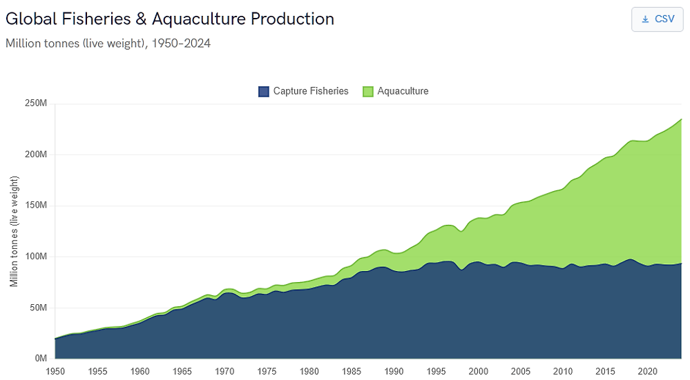
- Global Overview: The starting point. A stacked area chart tracks the growth of global capture fisheries and aquaculture production from 1950 to the present. A companion chart shows aquaculture production value in US dollars. Filter by any reporting state or by individual species to see how a country's output or a single commodity fits into the global picture. Toggle capture fisheries on or off to focus on aquaculture alone.
- Production: Which species dominate world aquaculture, and how is the mix changing? This section ranks species by both volume and value for any selected year. Paired donut charts show the production mix across major taxonomic groups (fish, crustaceans, molluscs, aquatic plants and others). Click any species bar to jump straight to its country-level profile. A year selector lets you step through the time series to see how rankings have shifted.
- Species Profiles: Pick any farmed aquatic species, by common name or scientific name, and see which states produce the most of it. Paired donut charts break down production by FAO continental region (volume and value side by side), and horizontal bar charts rank the top producing states. This helps answer questions like "Where is whiteleg shrimp farmed, and who are the biggest producers?"
- Trade: Track the volume and value of global fisheries and aquaculture trade over time. Imports and exports appear as separate series and can be toggled independently. Filter by state to see a single country's trade profile - useful for understanding trade balances, import dependency or export market development.
- Environment: How is aquaculture production distributed across freshwater, brackishwater and marine environments? This section charts both volume and value time series by production environment, globally or for any individual state. It reveals patterns that aggregate figures hide, for example, that fish aquaculture is overwhelmingly freshwater, even though overall aquaculture tonnage is roughly split between marine and inland production.
- Consumption: A world map shows apparent per-capita aquatic food consumption (kilograms per person per year), using the class breaks from the FAO Yearbook of Fishery and Aquaculture Statistics. Hover over any country to see its figure. This view puts aquaculture production into the context of food supply and nutrition.
A companion Food Insecurity map shows the prevalence of moderate or severe food insecurity by country (SDG indicator 2.1.2, drawn from the FAO Food Insecurity Experience Scale). Viewed alongside the consumption map, it highlights the regions where aquaculture development could have the greatest impact on food security.
Designed for fast, practical use
We built the Dashboard for anyone who works with aquaculture data and wants fast-loading charts without having to run queries against raw datasets. Filters update dynamically: select a state, and every chart on the page refreshes in place. There is no waiting for large files to download or process. Several features support practical use:
- Member state quick-select: Click a flag icon to instantly filter to any NACA member state. One click filters; a second click returns to the global view.
- Autocomplete search: Type any part of a country or species name to filter. You can search species by common name or scientific name. All country names are the official designations used by FAO.
- Data export: Each chart offers a one-click CSV download of the underlying data. The CSV contains the full, unaggregated dataset (not just the bars visible on screen), so it is suitable for reports, spreadsheets or further analysis.
- Persistent context: Your state and species filters stay active as you navigate between sections. Select a country on the Global Overview page, move to Trade, and the same country is already active - no need to re-enter it.
- Interactive tooltips: Hover over any data point, bar or map region to see the exact figure. Stacked charts show both the individual series value and the total.
We encourage you to experiment. Filter, compare, download - the data is there to be used.
Data sources and licensing
The Aquaculture Statistics Dashboard draws on several open datasets published by the Food and Agriculture Organization of the United Nations (FAO):
- Global Fisheries and Aquaculture Production (v2026.1.0): Capture fisheries and aquaculture production quantities (1950 - present) and aquaculture production values (1984-present). Published by the FAO Fisheries and Aquaculture Division.
- Global Aquatic Trade Statistics (2025 division): Imports, exports and re-exports of fisheries and aquaculture products by volume and value. Published by the FAO Fisheries and Aquaculture Division.
- Consumption of Aquatic Products: Apparent per-capita aquatic food consumption derived from FAO Food Balance Sheets. Published by the FAO Fisheries and Aquaculture Division.
- SDG Indicator 2.1.2 (FIES): Prevalence of moderate or severe food insecurity, measured with the Food Insecurity Experience Scale. Published by FAO as part of the SDG monitoring framework.
The data is published by FAO under the open CC BY 4.0 attribution license. You can access the original datasets from the FAO Fisheries and Aquaculture Statistics portal.
Creative Commons Attribution.